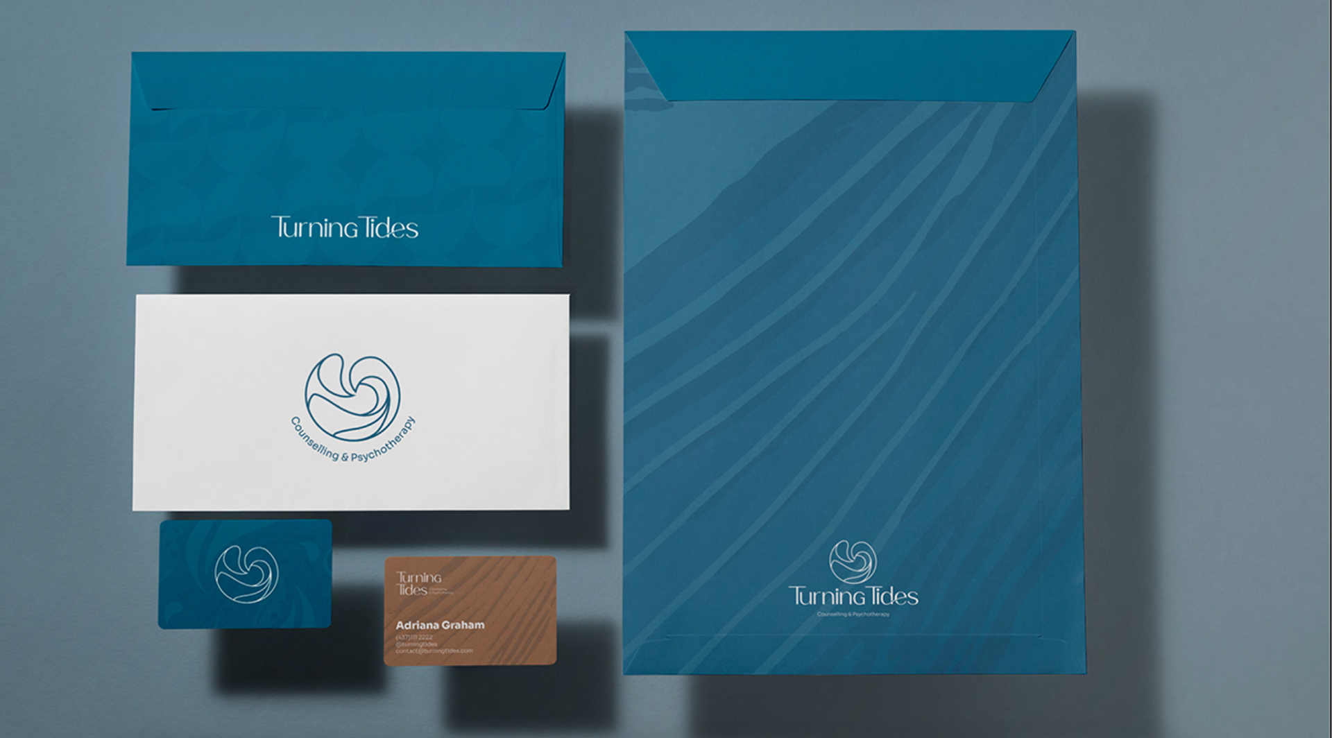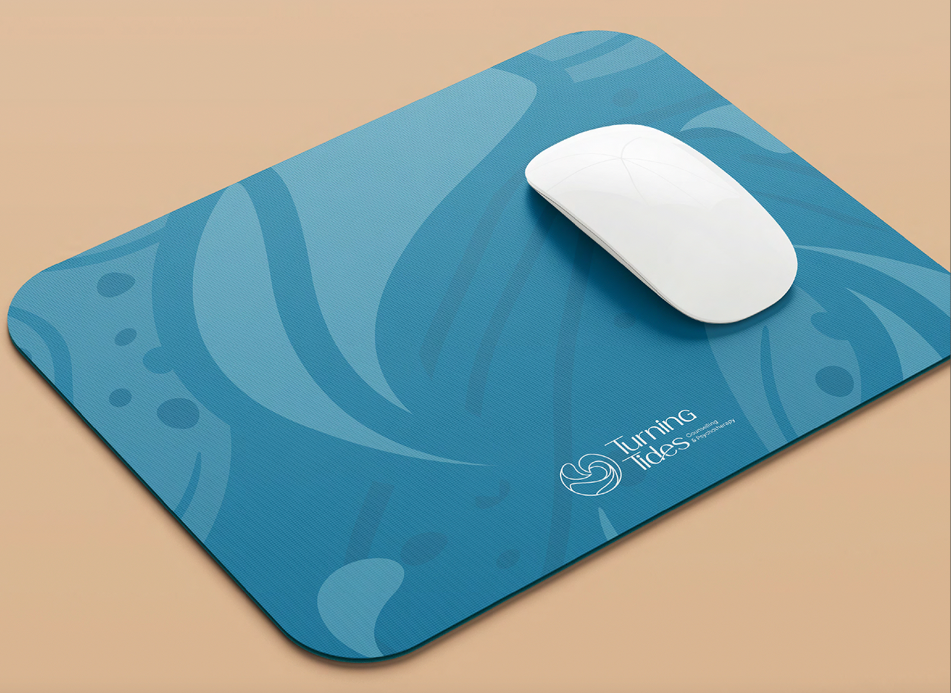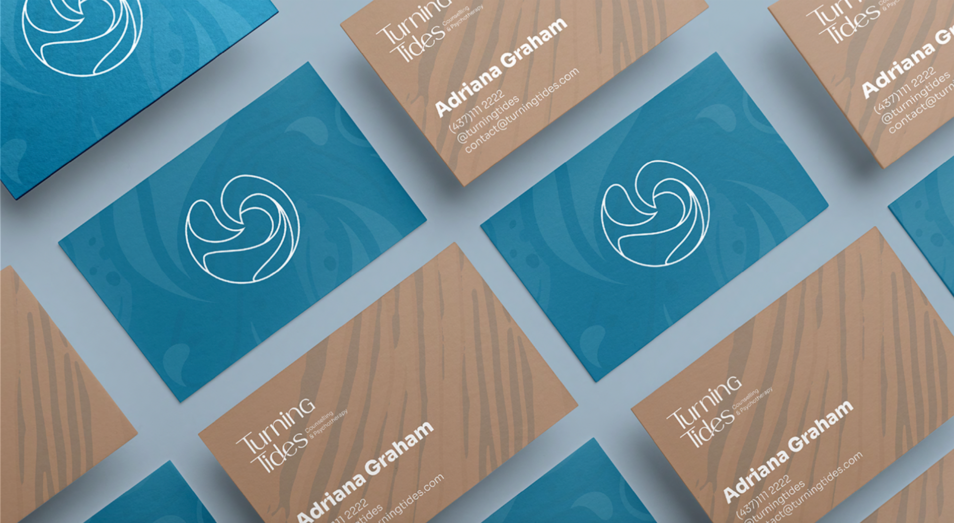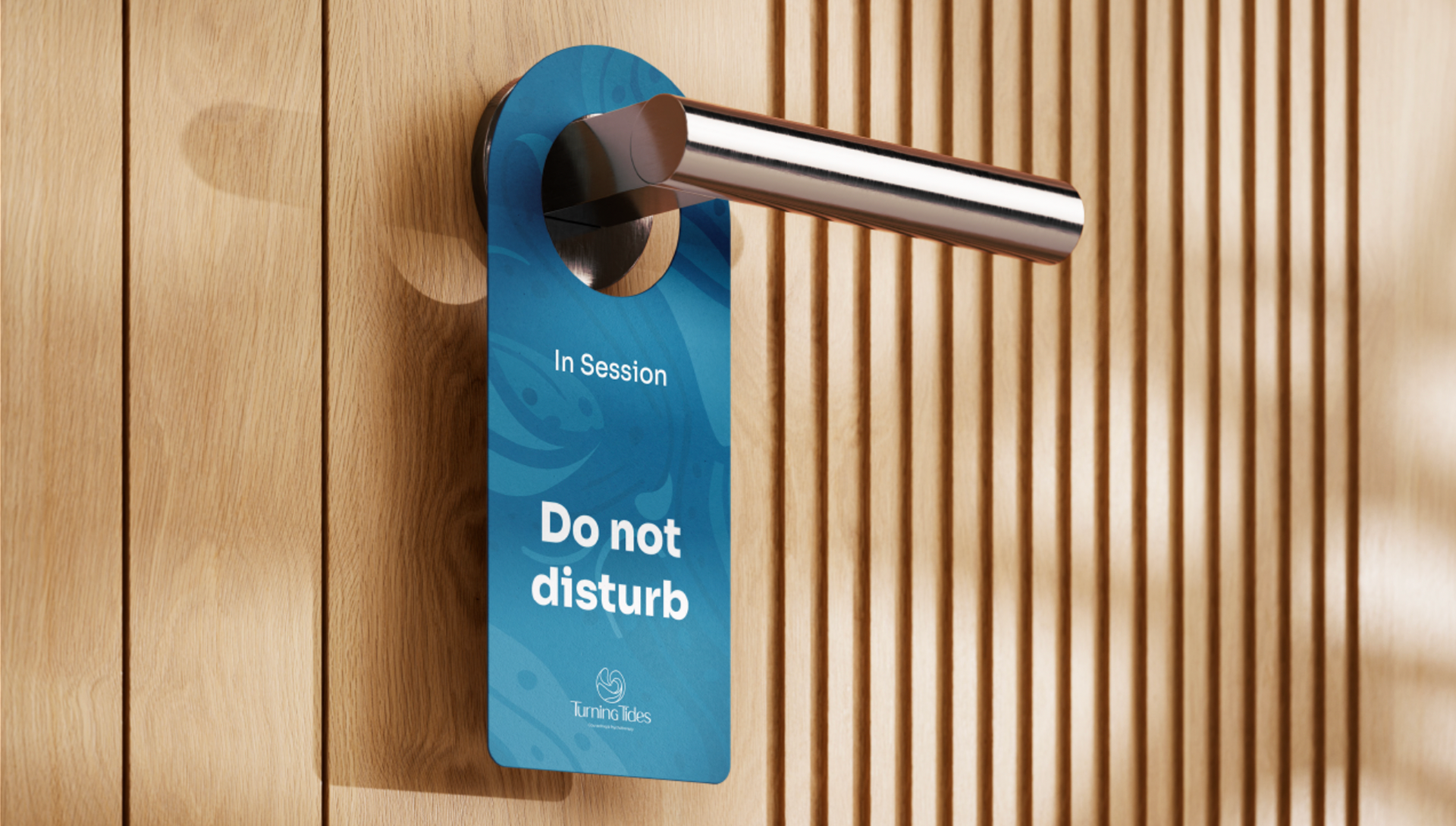
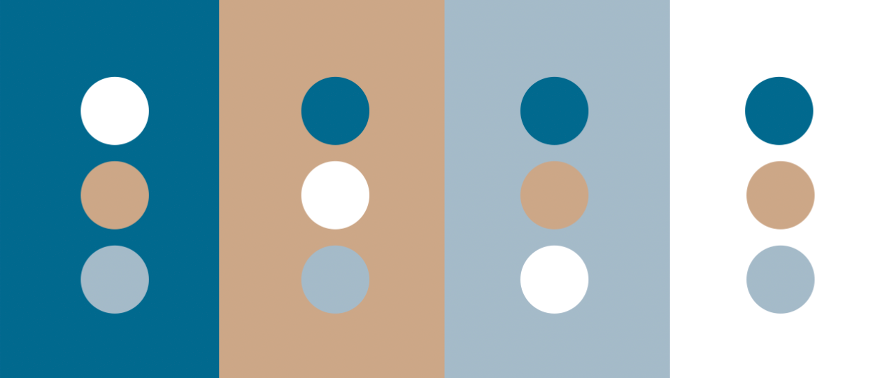
Colours
The main brand colour is the shade of blue with a hint of green embodies trust, reflects emotional well-being, hope, and growth symbolizing the professionalism and elegance of Turning Tides. The lighter blue with a hint of grey alludes to lightness, stability, tranquility, and harmony. The light brown symbolizes feelings of comfort and calmness. Together with white, it represents the sensations of being in a light environment, where one can feel comfortable. It is also a primary colour of the brand. The white colour symbolizes peace and clarity. It contrasts with all colours and enhances the legibility of the brand.
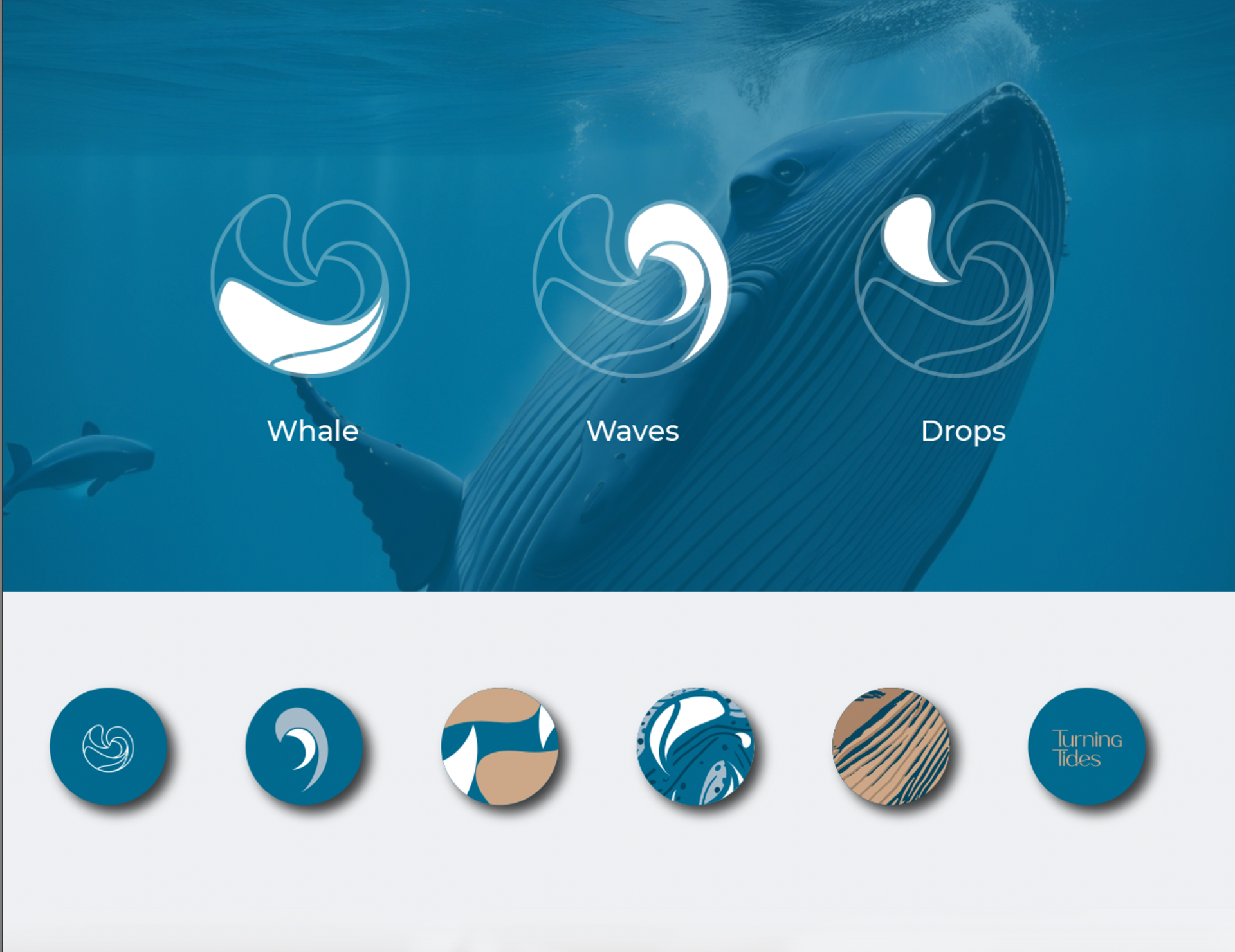
Logo Creation
To create this logo, we incorporated three symbols into our creative process that resonate with the story of Turning Tides: whales, waves, and water drops.
Waves: The undulating waves in this pattern symbolize the perpetual motion of life's journey, echoing the concept of Turning Tides. As waves rise and fall, they reflect the highs and lows of human experience, ultimately leading to growth and renewal.
Whales: Whales are often associated with feelings of renewal and transformation due to the migration cycle of their lives, which mirrors the transformation experienced by Adriana's patients after being treated by her.